In Excel 2013, there are massive changes in charting. Now you can create combination charts, add secondary axis, set up smart data labels, format the chart or switch styles with ease. Microsoft revamped the default formats too so that when you make a chart from data, it is ready for presentation (with out too many tweaks).
Some of favorite charting features are,
- Recommended charts feature that tells you which charts go well with your data.
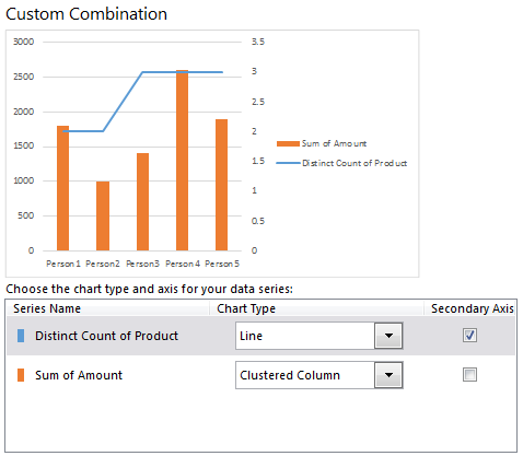
- A screen where you can change the chart type for each series easily.
- Common chart customizations are a click away
- Ability to create scatter plots based on a variety of input data layouts.
That said not everything is rosy with 2013 charting. For example, I do not like that we have to go through sidebar pane to customize charts (formatting etc.) instead of dialog box.
No comments:
Post a Comment